Back towards the end of July, I shared the part one of our redecorating story, and boy was that embarrassing to post! Like I had previously mentioned, we knew that this apartment wasn’t going to be our forever home, but something shifted inside me whenever we found out that we were expecting and I went a little nuts trying to finally complete this little space we call home.
So, here we go…

Dramatic change, huh?
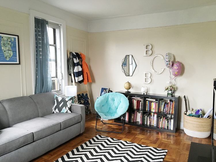
Our main goal with this project was to create a space where we all want to hang out together as a family, versus heading off our own separate ways. Since our living room is not only a shared space but Branden’s bedroom, too, we needed to make it kid-friendly, a space with a ton of storage options, and a place that he can really call his own. With the help of my amazing sponsors I think that we achieved that and I feel so much better about our little living space.
Okay, so time to break down all these pieces for you!

Our new sofa couch came from Costco (not sponsored) and is so incredibly comfortable and the color pairs with pretty much everything. Because the living room doubles as Branden’s bedroom, we needed to make sure that we had a sofa couch and something that easily transitioned from one to the other. I spent a lot of time researching and so many furniture stores required a deliver fee of $300 and up, so I randomly searched the Costco website and found this beauty. Under $1000 and delivery fee included!
This super fun rug comes from Lorena Canals, which is a company that focuses on nursery spaces, so I knew I would find something amazing that was conducive to both a modern and kid-friendly look. Each of their rugs are machine washable, which is fabulous and something that you don’t often find from an area rug. Perfect for littles who are always hard at play!

This piece of artwork came from Minted and was one of the first pieces that we got that truly inspired the rest of the colors of the room. It’s from their Kid’s Art section and we absolutely love how unique it is and shows our kiddo’s love for New York City. You can choose from so many different sizes and frames when purchasing, so you can really coordinate with your decor.

One of our book shelves got a complete makeover and we removed the wall art completely and opted for a much more modern gallery wall. I love this idea for this type of space because we were able to combine this super cool Prisma Mirror from Umbra with these fun and kid-centric silver letters from HomeGoods. I love how both my baby’s initials are present on the wall as well as our last name!

In this corner we cleaned up (and got rid of many of) Branden’s toys and I was desperate to find a storage basket that was big enough to throw everything into and conceal most of it – which we found with ease at Marhsalls! It’s seriously amazing what having a piece like this can do for de-cluttering a small space.

I call this little nook “Branden’s Corner” because this is where we made sure we had a spot to grab things that he needs for school and beyond that is really his own. First of all, this Umbra Leanera Coat and Shoe Rack is genius! We quickly became Umbra addicts while working on this project because all of their pieces are modern and super functional – which is exactly what we needed living in a small space. I love how Branden will now have everything organized (both shoes and all of his sweatshirts and jackets) and they are visible, making them easily accessible when getting ready for school.

I just wanted to make sure to share a close-up here. I mean, for every family that has missed the bus because your kid couldn’t find a missing shoe – this will help keep you organized. No more excuses!

This is another Umbra favorite! I love how we have a storage spot for all of Branden’s electronics and remotes with this Travalo Side Table. I had been wanting something like this for so long, but had never stumbled across anything as perfect as this one. (Hint: we seriously haven’t lost a remote since adding this piece to our living room decor.)The picture from is also from Umbra (which can be found here) and matched our mirror perfectly, typing all these pieces together. I haven’t filled the frame yet, as I’m waiting to get some super special brother/sister pictures printed!
The lamp and matching chair (not pictured here) are from good o’l Target (not sponsored, just pieces we picked up to pull the room together). And these gorg pillows? They were also from Minted, where they have the most beautiful pillows to choose from!

And here is what the couch looks like all pulled out to a queen sized bed! And our little guy sleeps so sound with his awesome Bedgear Kids Performance Pillows that are sized specifically for your kiddos and helps keep them cool at night.

Here’s a close-up picture of the pillows. Our little man is seriously obsessed with these and we also have the crib sheet and mattress cover for Blake.
Looking for some home tips?
- Why We Love Colorhouse Pants
- Making Our Apartment a Home, Finally
- Living With Mr. Grumpy
- When All Else Fails, Call Your Fairy Godmother
- This is the Day!
- How to Prepare For a Baby When You Live in a Small Space
What do you think of our transformation of our small space? I’m enjoying all of these pieces and so is the rest of the fam! Huge thanks to all of our amazing sponsors, please check them all out for amazing pieces to help update any space that you have. I truly feel like our apartment has become a home.
Fashionably Yours,
Allison

